Let’s be honest. When we talk about our outlets, we usually go straight to the obvious things. The food, the drinks, the space, maybe the playlist if we’re feeling extra. But there’s one thing that quietly shows up across almost everything we put out, and somehow rarely gets the spotlight: illustrations on menus, flyers, booklets, even bits of branding here and there.
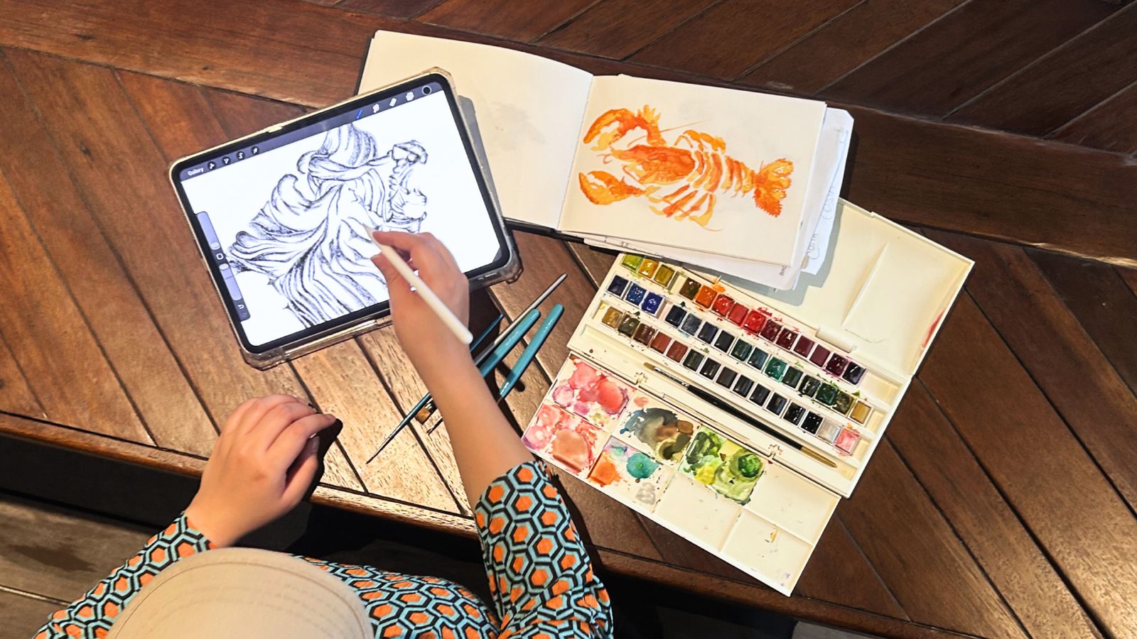
Behind a lot of these? Is our graphic designer (ehm, slash illustrator), Eberta Sulistyaningrum or Berta, as we call her. She’s not the loudest person in the room. Actually, quite the opposite. But give her a blank canvas, and suddenly there’s a shift. “I can be more loud there,” she said. And here, you'll begin to understand what she meant by that.
---
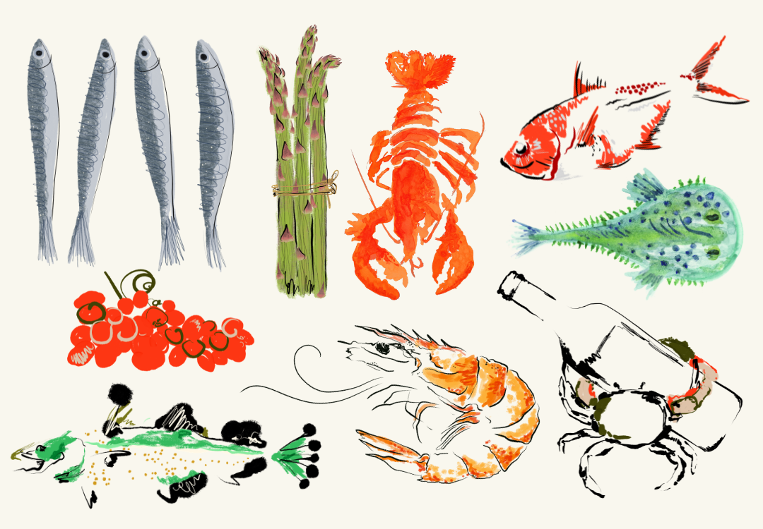
On Acta Brasserie: a more artisan take on food and wine visuals.
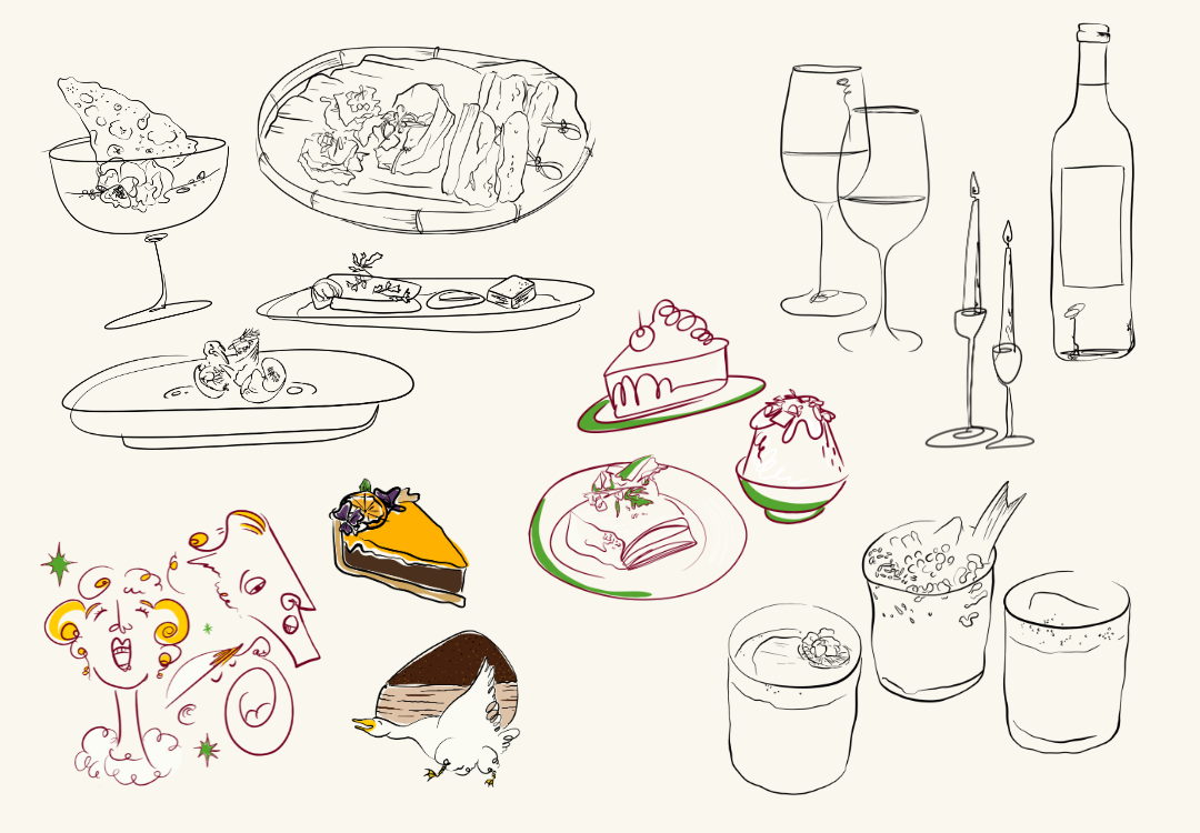
For a brand that centers around food and wine, the obvious route would’ve been photography. Instead, illustration has been part of the visual language from early on. Berta approaches it with organic, abstract lines that don’t try to be too polished. “I like it when it’s not too perfect,” she said. “It feels more real.” In a space that’s often dominated by clean, glossy visuals, this kind of treatment shifts the mood slightly. It softens things. Slows them down. And somehow, it makes you look a bit longer.
On Cantinero: ancient references translated into a modern visual system.
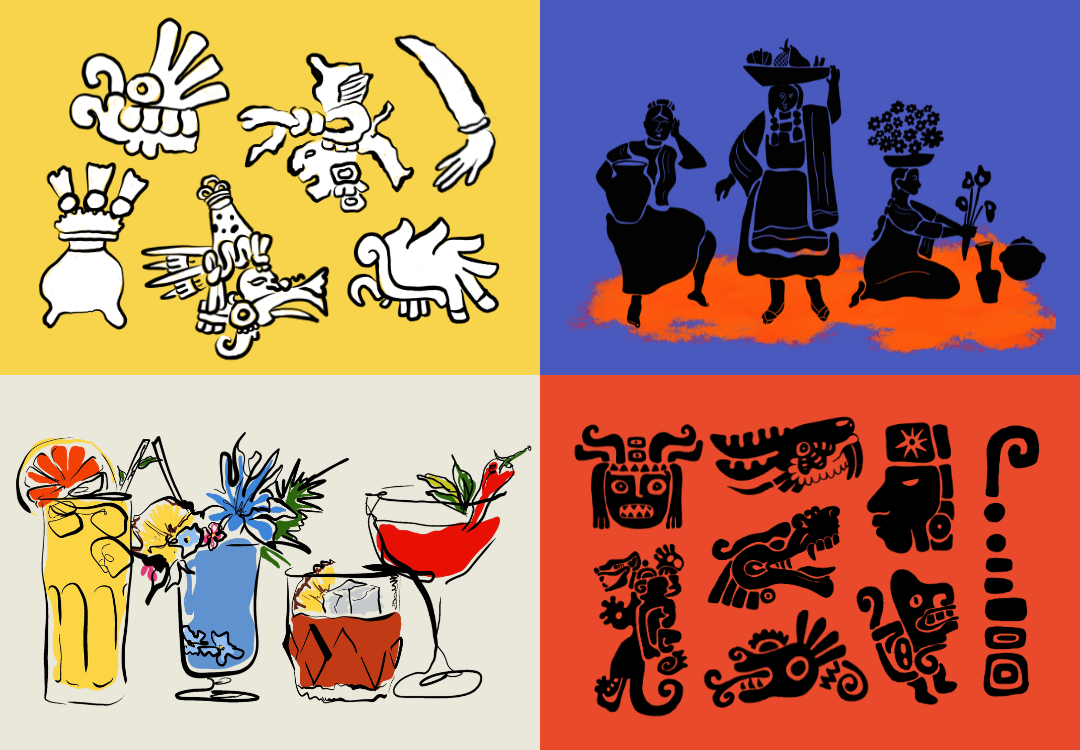
Cantinero is where things get more built-from-zero, with Berta involved from the start in shaping not just the illustrations but the overall visual identity. The references go back to Olmec civilization and traditional Mexican market signage, but the direction was to keep it modern. So instead of going full decorative, it lands somewhere bold, solid, and a bit playful. You’ll notice forms that feel almost carved, slightly rough, not too polished, often set in black against vibrant, colored backgrounds. Add in custom typography that ties everything together, and the result feels ancient if you squint, but overall, very now.
On Fūjin Izakaya: where oni and yokai meet watercolor and line work.
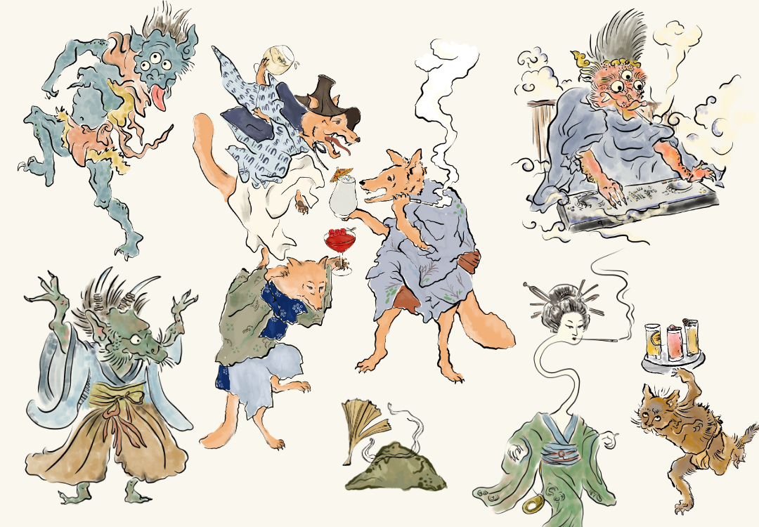
Fūjin Izakaya is where Berta gets to have more fun, and you can tell. Inspired by old Japanese paintings, she brings in oni and yokai characters that add personality to the brand. Not in a gimmicky way, but more like they belong there. The colors lean watercolor, but still layered enough to have depth. Then come the rough line accents and brush strokes that don’t try to hide the process. It’s a mix of controlled and not-too-controlled, which is probably why it feels alive. Also, according to her, this is one of her favorite things to work on. To be honest, we get it.
On Costa: a more open approach, guided by the mood of the menu.
Costa plays by different rules, or actually, not many rules at all. There’s no fixed style that everything has to follow. Instead, the illustrations adapt depending on the material. A flyer might look completely different from the next one. Berta treats it almost like a reflection of the menu itself. Varied, a bit experimental, and open to change. This is also where she mixes manual and digital techniques the most. So you’ll see textures that feel more hands-on, layered with digital finishing. It’s less about consistency, more about matching the mood.
For our graphic designer here, illustration isn’t just another output. It’s one of the parts she enjoys. “It’s my peace,” she said, very casually. But there’s also a bigger point in there.
“I think illustration puts a soul in a brand. Especially if it’s manual. It’s not too perfect, but that’s what makes it feel more alive.”
--
If you love her works and would like to see more, you can visit her page here.


